Mastering the Flat Lay
How to take beautiful product photos

One of the important aspects of running your own creative business, is being able to showcase your work well. You build trust with potential clients when they see beautiful images of your work, and a thoughtful, consistent feed. You'll also need great images if you want your work to be featured on blogs and other accounts! This post is also for photographers too - I see gorgeous shots from these amazing weddings, or styled shoots and then you get to the detailed flat-lay shots of invitations and these photographers have no idea what they're doing. Things are thrown together haphazardly, on a dull and flat surface, in dim light. And to the stationer: this will probably still happen to you, but if you can master your own flat-lay game, you can keep designing those dream suites in order to land that dream client, send it off to the styled shoot and you don't have to worry about whether or not you'll get usable images back because you have your own! Cause let's be honest, there's nothing more crushing than pouring in the time, and creative energy to make a suite for free only to get un-usable photos in return.
In 2014 I went to a Stephanie Fishwick's calligraphy workshop, and would you believe, Corbin Gurkin was there! Yes, Corbin Gurkin, as in the photographer regularly featured in Martha Stewart Weddings, Harpers Bazaar, Vogue, etc. And Corbin taught us how to capture the perfect flat-lay. I took those elements and implemented them into my budding business strategy and slowly but surely I saw my brand starting to emerge and my feed coming together...


Your Style
What do you want your brand style to be? Light and airy, dark and moody, woodsy and textured, fun and bright? Pick a style, and a basic color palette, and keep those in mind whenever you post an image to your feed. If you're posting client work it isn't always easy to control the color palette and style, but you can include some common threads to tie all your images together. Maybe your brand style is light and airy, but your latest client wanted dark, fall colors - how will that fit in with your feed and look cohesive? Try using a light background, and pop of light accessories throughout - like some ribbon, or a dish that has one of your brand colors.
Natural Light

This is probably the most important thing to keep in mind when taking great photos - utilize natural light! Where in your house do you get the best light? I specifically designed my office to have my desk wrap around in front of both of the windows. I also bounce the light back onto the suite by holding up a white sheet of poster board, this eliminates some of the harsh shadows the light can create. The best type of light comes from a cloudy day, don't want too direct of sunlight.
The Background
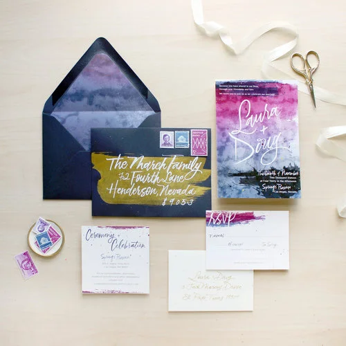
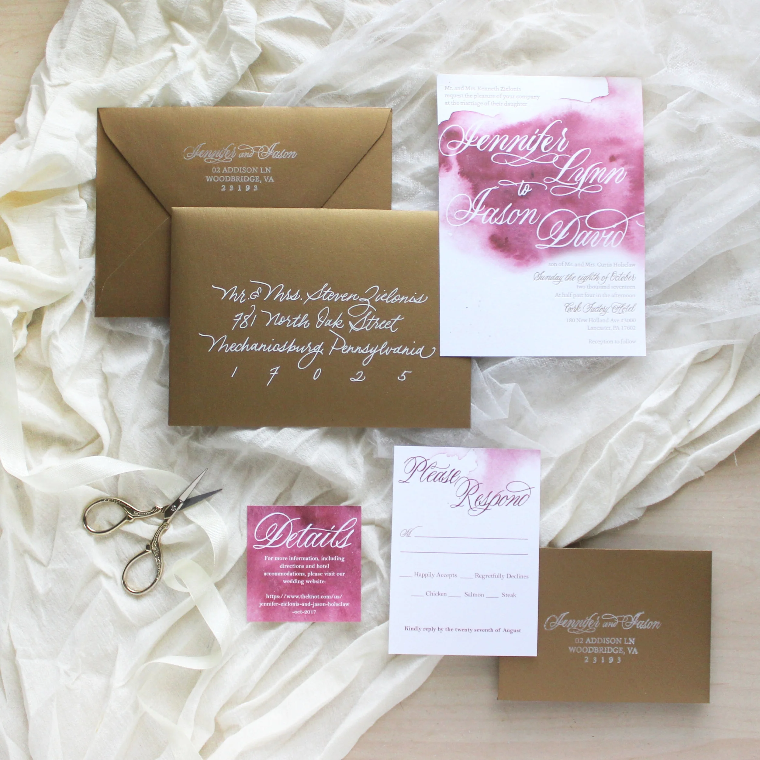
What your work will be laid on is a big deal, this is a great place to add some texture to the shot. Flat lay images can tend to be, well... flat. So it's nice to add some dimension and character through texture. Paper, envelopes, prints, all typically have the same feel, so try balancing the smoothness out with some rippled fabric, a pretty gold tray, or some distinct wood. You can also use this area to pull in one of your brand colors, or a color from the invitation suite itself.
Styling Accessories
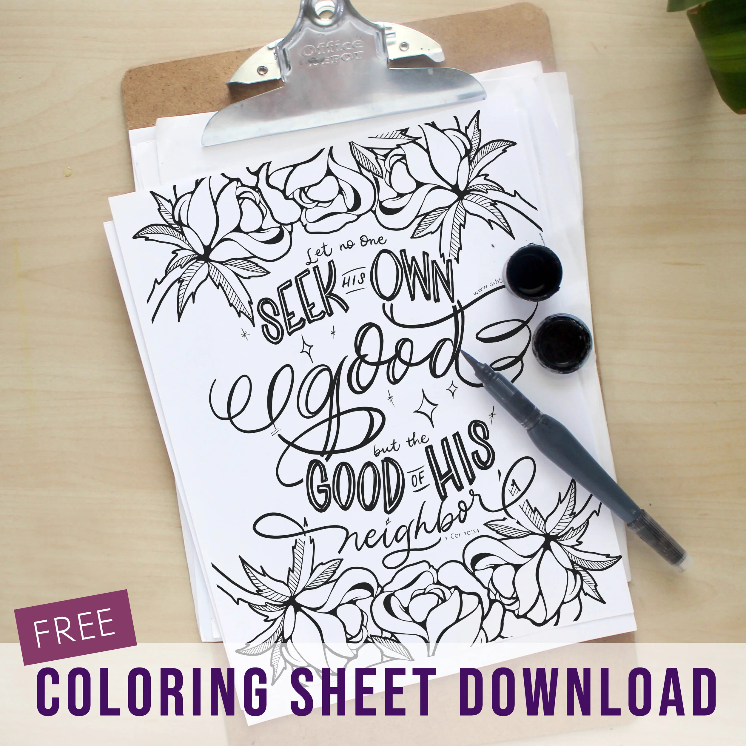
This is my favorite part! Styling. There's so much cute stuff out there for your brand, and it's one of the reasons why I love making calligraphy tools that are also pretty. Speaking of pretty tools, we're almost done perfecting our new line of accessories!! This new line will include low cost pens, rests and ink holders and will of course be gorg, in multiple colors to match all your different styles. I'm so super excited to get these out to you the end of February/early March! Here are some other ideas for things to add to your styling stash. This list contains affiliate links.

- Ribbon
- Stamps (my fav Etsy shop & Ebay)
- Scissors
- Calligraphy pen & accessories
- Dish
- Confetti
- Wax seal
- Vintage nibs
- Greenery, flowers
- Handmade paper
- Candles
- Ring box & The Mrs Box
- Washi tape
- Cute jars & Cork top jars
Layout
This is probably the most difficult aspect, and just takes time to learn. Some things to keep in mind for creating a pleasing layout are...
- Balance
Is the overall image well balanced? Are there any glaring blank spots, uneven lines, competing sizes, overly crowded areas? I'll take a picture and then take a few steps away from my screen to look at it from further away, I'll also try squinting my eyes to blur it a little bit and see if one area stands out over others. - Where does your eye go to first?
Is it the thing you want it to be attracted to first? If it's your biggest invite, or envelope, that makes sense. But if it's a brightly colored ribbon in the corner that doesn't make sense. You also don't want to overwhelm the eye - have one or two big, captivating pieces that stand out the most and let the others fade into the background as secondary items. If the suite is very busy, patterned or colorful, try to keep surrounding colors and accessories more muted and subdued so your work takes the center stage. On the flip side, if the suite is a simplified piece, try creating a stand-out image by playing up the surrounding areas with florals or stamps. - After the initial grab, where does your eye travel?
Is it a seamless, comfortable path? If you have a bright envelope in the top left, it would be natural for the eye to travel along the suite down to the bottom right of the image. You don't want a disjointed image where the eye is hopping from one bright spot in a corner, to another bright spot on the opposite side. The path should also make sense to the story you're telling - so a natural path for an invitation suite would be an initial grab with the main invite and envelope, then move down to the rsvp and details card and envelope and then to the accenting accessories. - Depth
Another important element, in the same vein as texture, is depth. Flat-lays lack depth, this is what makes them so tricky. So we need to improvise to create levels and dimension. Use bottle caps underneath your pieces to add the depth you're looking for - but not too much depth that it looks weird. Propping your main pieces up in the foreground makes sense, and then overlapping and laying the secondary items underneath also helps develop a natural path for the eye to travel. Keep this desire for dimension in mind while styling your accessories as well, like ribbon and stamps, try not to lay them completely flat, and overlap them with different pieces. - Breathing room
Leave some space around the edges of your image, and some elements. Don't want the edges of things to be squished too close together.


Editing & Cameras
I use a Canon Rebel t3i camera and I edit in Photoshop. This is just where I'm most comfortable working because this is how I was taught in design school, but with smart phones these days it's not necessary to go out and purchase a fancy camera. You'll get great images for your feed just using your iPhone! Get a tripod for your camera, to place it directly over your work, and this way you can make sure it stays still and is level. As for editing, Instagram has all you really need! I would recommend staying away from the pre-set filters and utilizing some of the manual editing tools - play with the brightness, highlights, warmth and contrast til you get it to a look that's appropriate for your style. If your brand is dark and moody, maybe bump up the contrast a little bit. If it's light and airy, work with the brightness and highlights, but be sure not to blow out your image too much, because you start to lose the details with too much light!
There you have it! Now you're on your way to more professional product photos and cohesive feed for your growing brand. Tell me, what are your favorite styling accessories?