My Hand-Lettered Logo Design Process
My Hand-Lettered Logo Design Process
The fact that I've built a business around logo creation is hilarious to me. It's even more crazy that I actually love it! Because a few years ago I decided I didn't like invitation design and I really hated logo design - too hard, too messy, too long and not enough money. I swore I'd never be a logo designer, much less a type-designer. Isn't it funny how life turns out?
I will say that I still hold some of that logo design fear in my heart, but the way I've overcome it is by really focusing on my strengths and what I love. I really narrowed down my focus. I am not a generalized logo designer. If you want a logo mark I am not your girl. I find no joy in that side of logo design. I specialize in hand-lettered logos, and watercolor elements/marks.
At first it was scary to narrow down my focus - would I get any work? Yes! It's amazing how much MORE work I've gotten because my competition pool is much, much smaller. I can now partner with other brand and logo designers as well as small business owners to add hand written and painted elements to their vision. If I was a jack-of-all-trades designer, one-stop-shop I would never be able to foster those other design relationships!
To alleviate the stress of logo design I've implemented a streamlined system that has proven to be very successful for me:
- Limited rounds of edits & hours: 2 revision/feedback rounds, and 1 final revision round to choose colors and layouts. And within those revision rounds I provide 3 different concepts to choose from.
- Super high-res transparent png deliverables instead of vectors: The final deliverables are always 1 main logo + a few different color options of that logo, 1 square/stacked version of the logo for social media and blog posts + a few different color options of that version, and an initial/watermark version.
- All at a set price of $400, +$50 if you'd like it in vector format
Brainstorming & Ideation
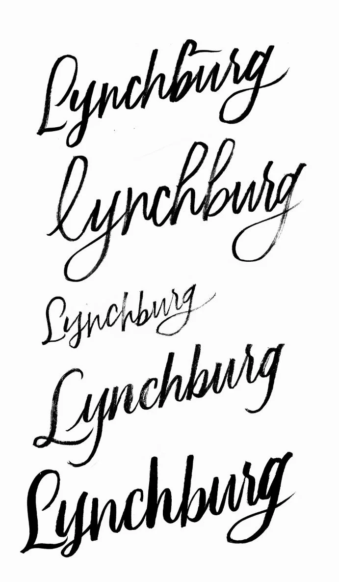
When I first launch a logo design project I start off with brain storming, sketching, and experimenting. I usually give myself 1 hour for that. I typically end up with a big stack of papers, like 20, and they look a lot like this:
Making it Digital
After the initial brainstorming I scan all those pages in at 600 dpi, sometimes even higher. Creating logos at such a high resolution means that I can leave them as transparent pngs instead of having to spend even more time by turning them into vector files. I offer that option, but it is at an additional cost (+$100). Honestly, I've never had anyone need the vector version of their lettering. The files I provide are such high-resolution that they work perfectly for every print material they need at 300 dpi, and even better for web at 72 dpi.
Now I utilize both Adobe Photoshop and Illustrator. But I spend most of my time in Photoshop. It's where I'm most comfortable and has almost all the same capabilities as Illustrator. I can create vectors right in Photoshop, which streamlines my process so I don't have to jump between programs a lot of the time. And if you're using Creative Cloud it can save you money to only have to work in 1 program instead of 2.
So I bring my scans into Photoshop and from their I remove the background around the letters using layer masks, brushes, a Wacom Intuos tablet, color range, and color overlays. I'll do a more in-depth blog post about that process in the future but for now you can check out a quick video tutorial I made earlier this year: How To: Creating Digital Vector Lettering From Scanned Images using Photoshop
From there I pick 3-4 very different versions to give a wide range of styles and present the client with those. Those initial concepts are rough and always in black so we can nail down the style first before getting caught up in the little details of things.
Presenting the Different Concepts
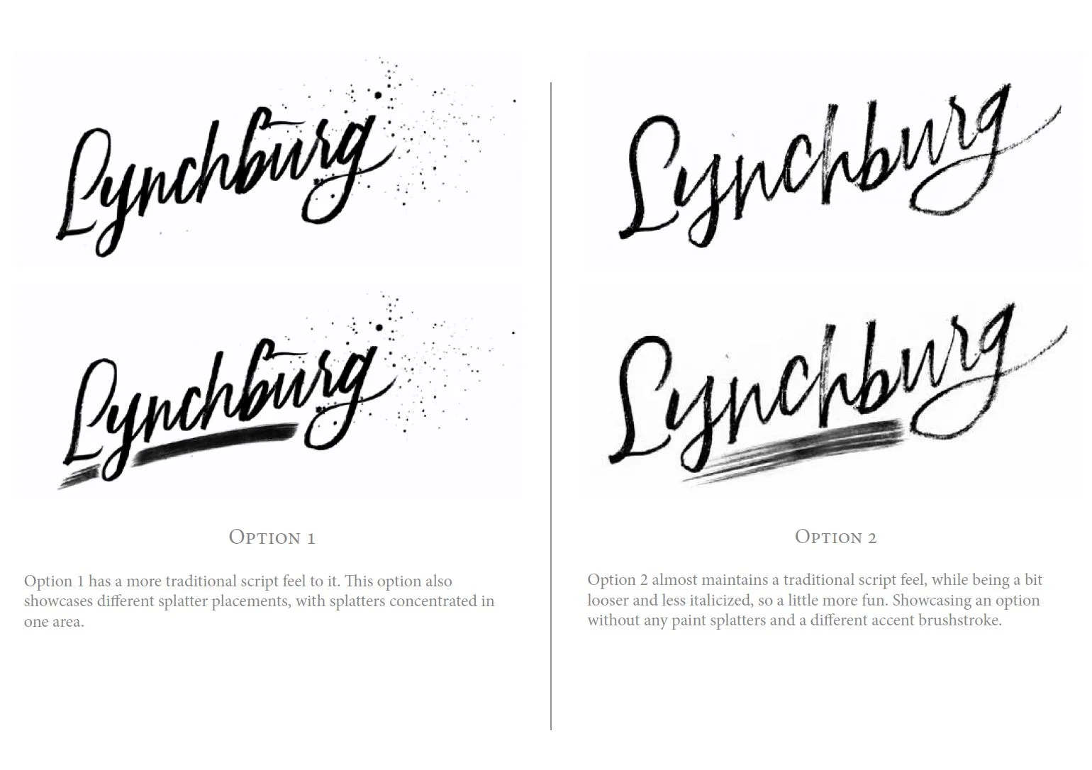
I then provide the client with a logo presentation PDF. The first page includes notes from the creative brief, overall design decisions, etc. Then each consecutive page includes the rough black lettering, a title, short thought process description.
The client then provides their first round of feedback:
"Option 2 & 3 are a little too bold, Option 1 is nice but I'd like to see a different s and all lowercase. And maybe a slightly less bold version of Option 3 as well..."
Having a specific idea for your logo is very helpful, saves all of us a lot of time and money if you already know what you're looking for, what you do and don't like.
From there I take those edits and create 3 more concepts, and this time those concepts are going to look more similar because we're refining and narrowing the vision down.
Those are presented again and from there we get the final feedback to land us at our final logo:
"I really like Option 1! The s kind of looks like a g to me, and maybe a bigger loop on the h."
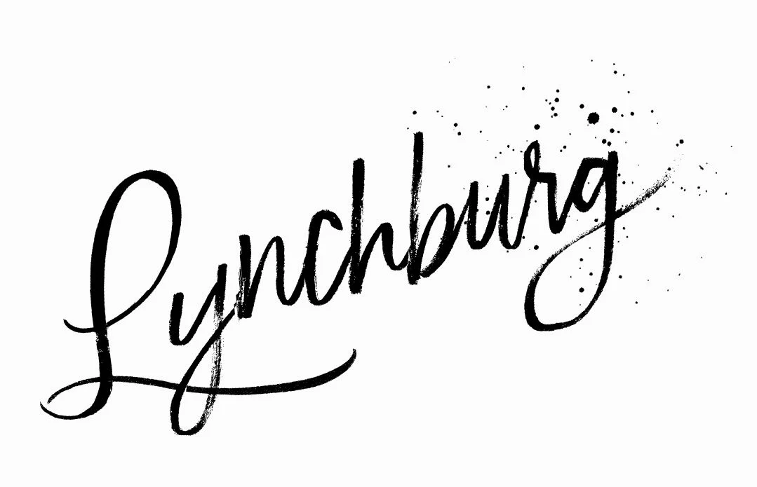
Awesome! Now we've got the final logo direction! This is where I really go in and do clean up. I zoom way in and clean up all the edges and start adding color and experimenting with different layouts.
Color, Layout & All the Deliverables
I send one last presentation document with different layout versions and color combo's and from there the client decides which assets they want! And then I zip 'em all up and send 'em on their merry way!
Now go check out Lynchburg's logo in action over on their website! And thanks Lynchburg for being the coolest client ever! :)
